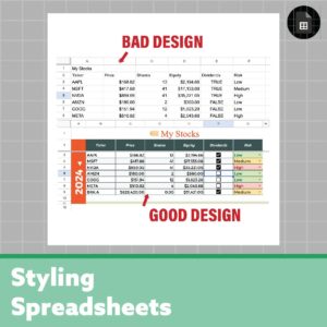
Spreadsheets at a glance are ugly, boxy, dull cells. With these simple tips, you can add life to your spreadsheet to make it look professional, modern, and beautiful. I’m not here to tell you things you already know, I’ll be showing hidden features that make all the difference! Here’s the secret to making beautiful, modern, and professional spreadsheets!
For this example, I’ll create a simple stock portfolio tracker and as you scroll you’ll see the spreadsheet improve, and no these are not stock recommendations! (: I use Google Sheets for this example, but all of these tips can be applied to Excel or any other spreadsheet software.
Make a copy of this spreadsheet and follow along!
1. Use Custom Colors (Color Palette)
I like to start my spreadsheets off by choosing a color theme to get an overall feel for it, and a color palette is a great way. Here we’ll be taking advantage of custom colors, and not just the ones provided for you (they are bland and basic). Custom colors make a beautiful spreadsheet.
For this example, I just googled “money color palette” and picked one that looks good. I also highly recommend this really neat color wheel free by Adobe!
Then I inserted the image into the spreadsheet (insert > image). Then you’ll be able to use the dropper to select these custom colors for background, border, and text colors. (paint bucket icon > custom section > eyedropper icon > click the color you want from the image).
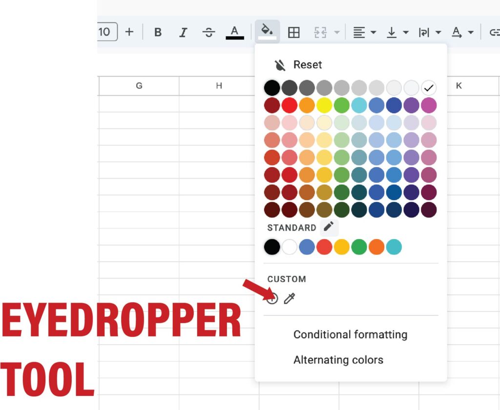
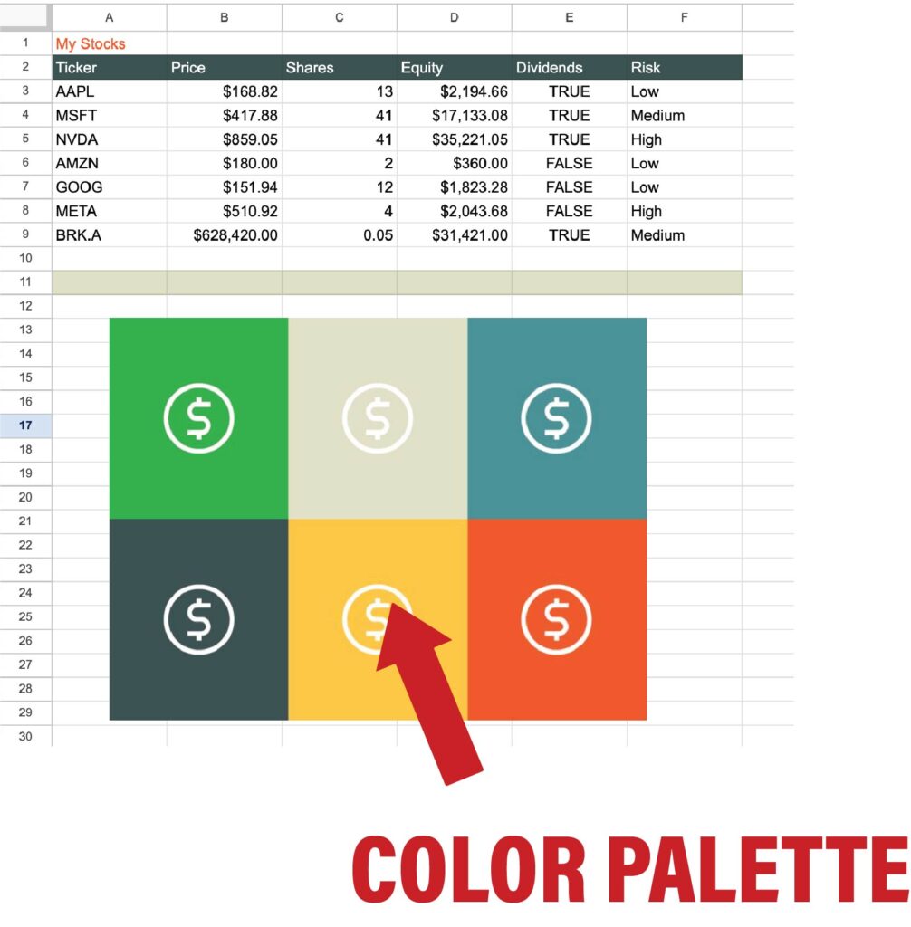
Your custom colors will be saved under the custom section, and as a bonus, you can add any color you’d like by using a HEX code.
2. Text Alignment and Merging
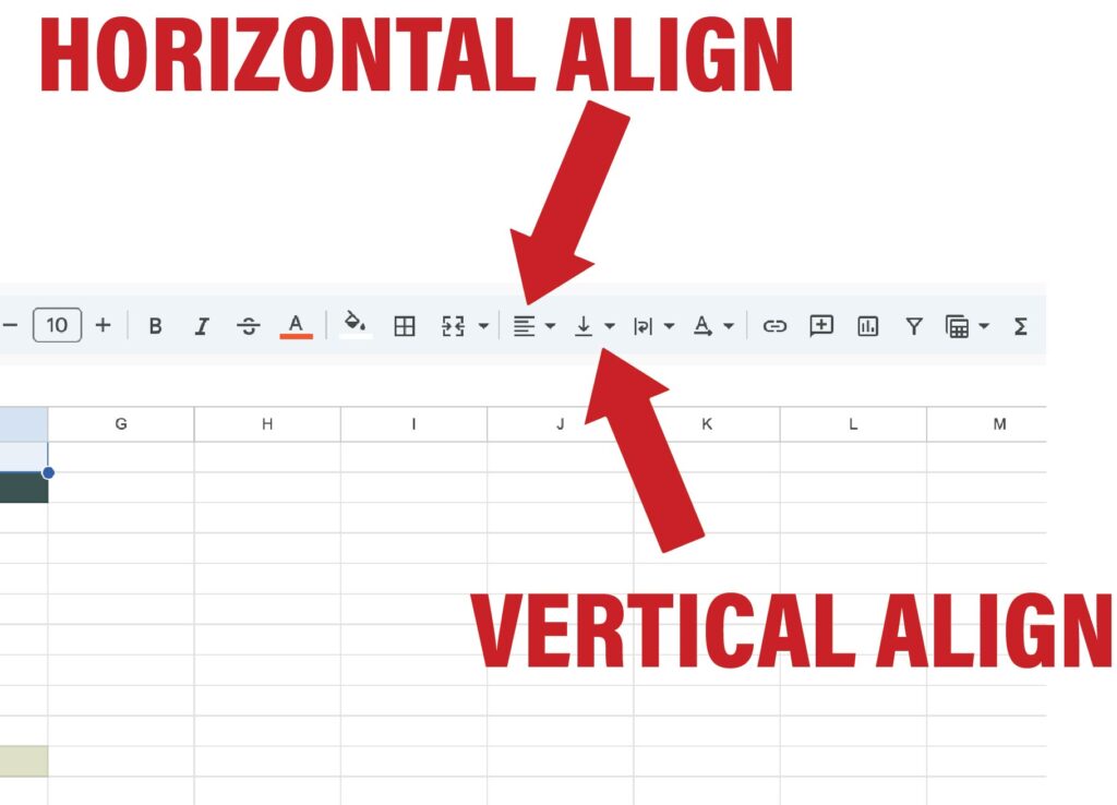
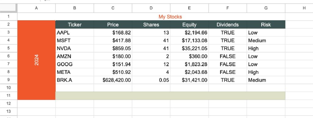
Aligning your text appropriately adds a professional touch and overall a cleaner feeling to your spreadsheet design. Don’t forget you can horizontally (left, center right) and vertically (bottom, center, top) align! Merging the cells for the header and footer would also look good here, which is what I did. Proper alignment shows a professional spreadsheet.
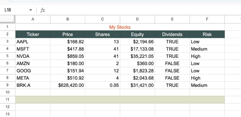
Here’s an updated look with alignment added, getting there!
3. Vertical and Rotate Text
An unknown but useful tool. I’m going to add ‘2024’ to the side of this spreadsheet and put the text sideways so it takes up less space. Rotating text makes a modern spreadsheet.
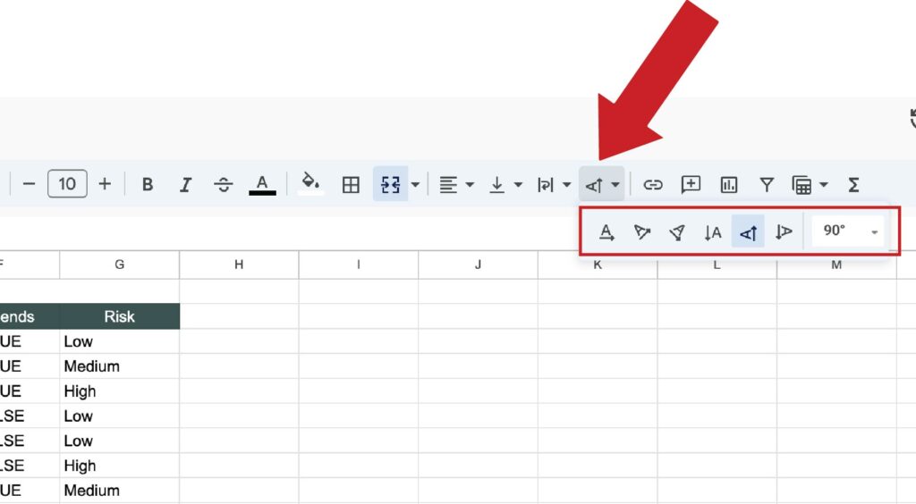
You have the option to rotate text and make it vertical. This opens up many possibilities for your spreadsheet design! I added 2024 sideways for this example.
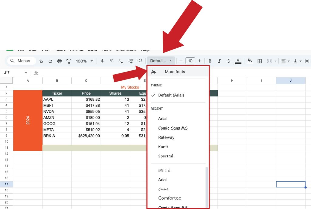
4. Text Fonts (Additional Fonts)
Just like the colors, spreadsheets give limited font options. However, you can add additional fonts very easily. Select the font in the menu bar > more fonts. You’ll see hundreds of options. Get fun with it, as the font can set the tone of the overall feel, modern, professional, or beautiful spreadsheet.
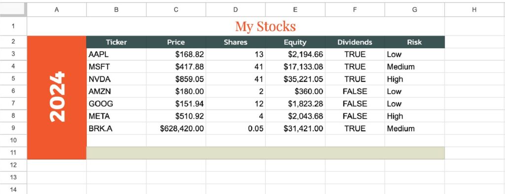
I’ll also take advantage of bolding and italics, which adds depth to our design. For fonts, many people like to use a serif and a sans-serif font to complement each other, but I am not an expert in font design! An updated look –
5. Adding Borders
Adding borders is an easy thing to add to make your spreadsheet more readable. You have unlimited options, you can add borders to any edge of a cell, customizing the color and line type. You’ll see you have 3 line width options, and 3 decorative borders. Keep in mind, if you select multiple cells it will act like just one cell when you add borders. To further explain, if you do just one right border on 3 selected cells, you’ll only see one as it only applies to the farthest right edge.
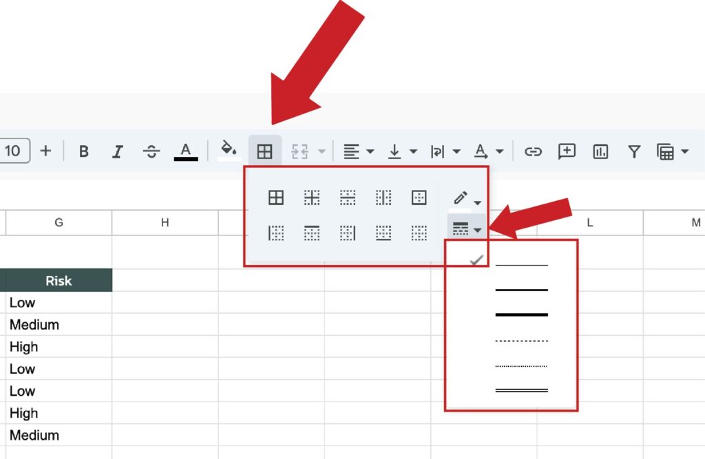
All I did here was add a white border in between the headers to separate them visually, and a dark blue border around our data.
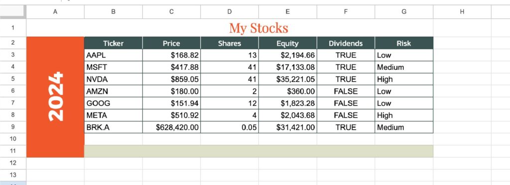
I don’t show it in the above picture, but a common way people use borders is to make the background a flat color by matching all empty cells with the color of the background. It gets rid of the ugly gray boxes. I’ll add this later.
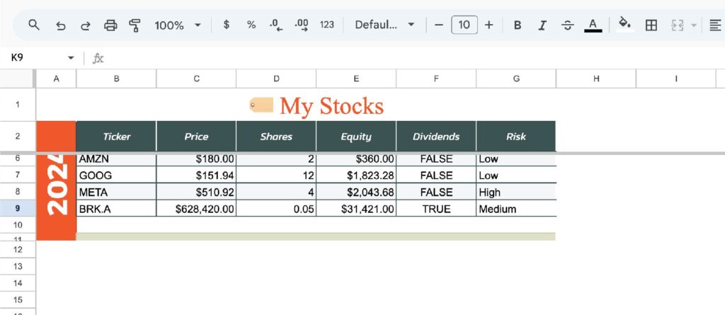
6. Alternating Colors
Alternating colors is a great feature that will automatically make each row an alternating color as you create rows. This makes large amounts of data much easier to follow and read! Select your data > format > alternating colors. I usually unselect the header option.
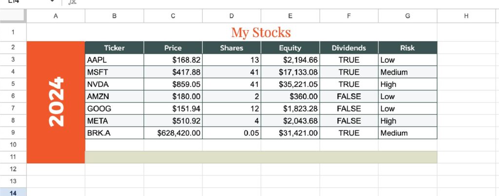
A notable difference even with a light gray!
7. Emojis and Images
Emojis are the easiest way to spice up your spreadsheets with pictures. The best part? It’s a built-in feature. Go into insert > emojis.
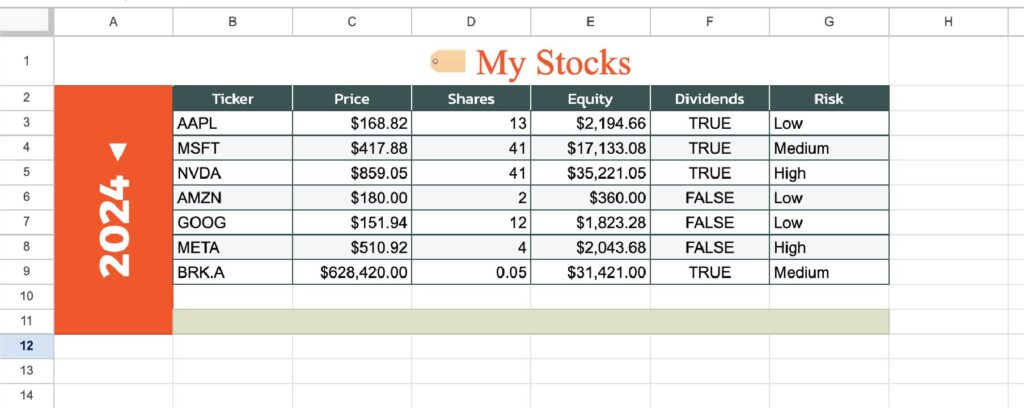
See? Emojis aren’t just for fun facial reactions. They add a nice and simple touch. They can be used as icons, visual aids, and much more. Furthermore, you can add your custom images the same way we added that custom color palette before. For more advanced people, images can act as functions and can call scripts. This is a great short example from Google.
8. Freeze Rows/Columns and Adjust Cell Sizes
Freezing the header will make it stay on top as you scroll. This can be done by dragging down the thick gray bars on the top left corner.
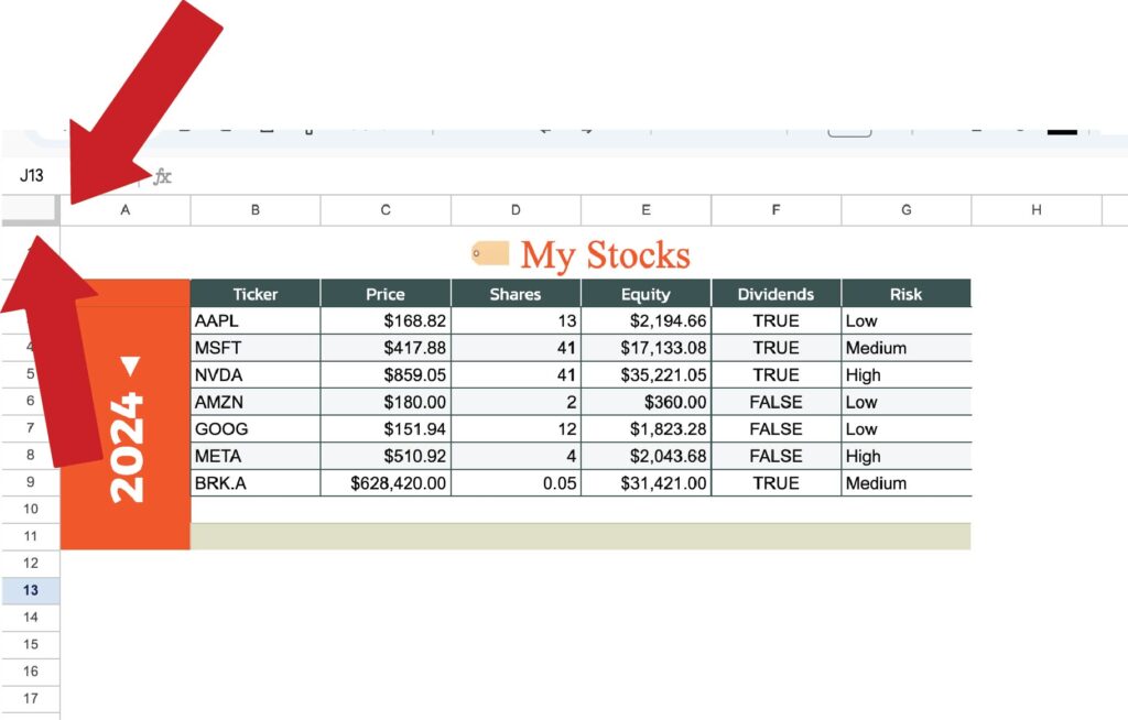
In this example, I only froze the header, but keep in mind you can also freeze columns! I also adjusted the size of some columns and rows, which is simple to do by just dragging the gray lines in between on the left and top. Here’s a screenshot mid scroll –
If you have additional questions, I wrote a quick tutorial on freezing and grouping rows.
9. Add Checkboxes and Dropdowns
Under the menu bar > insert you’ll see options to add checkboxes and dropdowns – both great ways to style your spreadsheet!
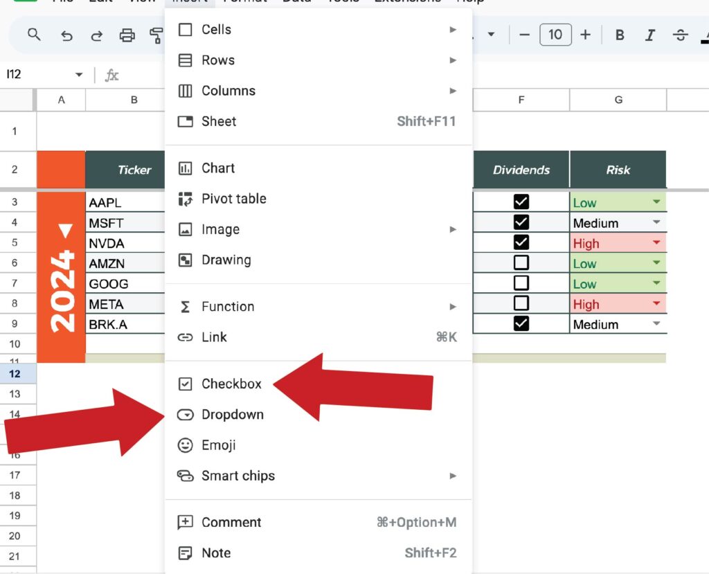
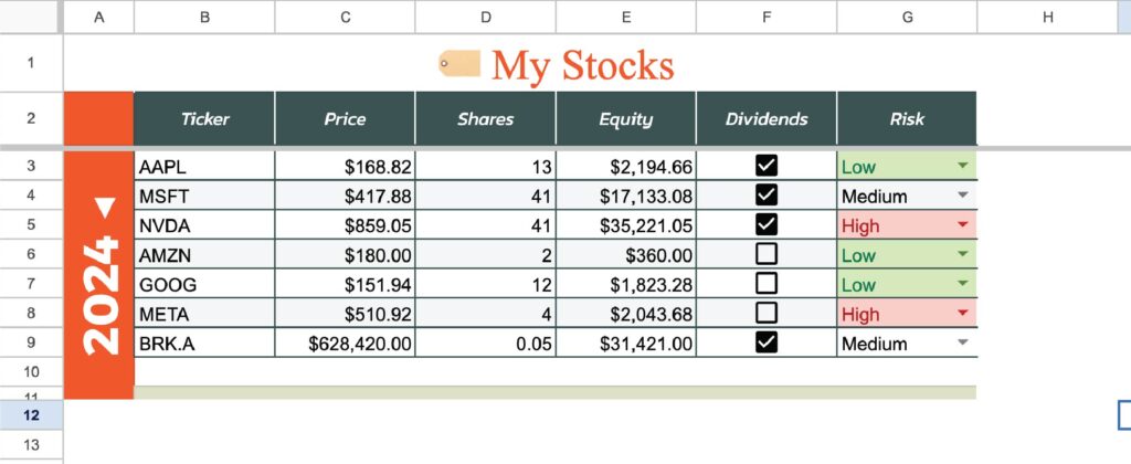
Here’s a further explanation of checkboxes if needed. The dropdowns visually add an arrow with dropdown options to choose from, adding color is an option.
10. Final Touches
I like to remove unused columns and rows, this makes the workspace smaller and cleaner.
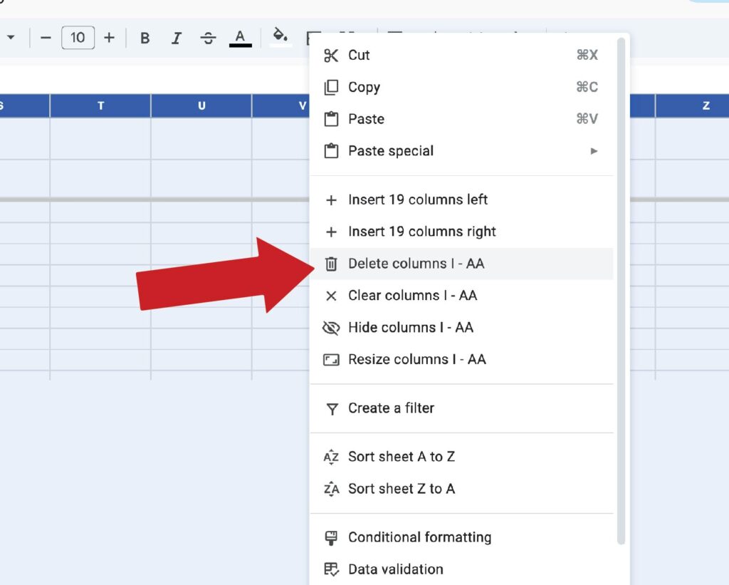
Additionally, group and hide columns to keep things clean. Also, make sure to take advantage of the spell check feature under tools > spell check.
If you want to go further, explore conditional formatting and charts for spreadsheet customization. Here’s a great brief article by Google.
I would spend 5-10 minutes just playing around with conditional formatting, and things will start to click!
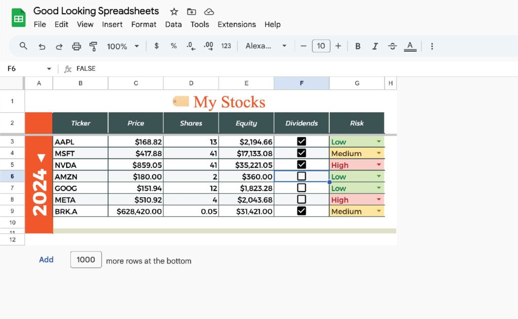
Final result